Project Summary
The purpose of the project was to improve the search experience, visual design, and information architecture in order to drive even more traffic to the site’s subpages.
Timeline: 12 weeks
Core Team
- Front-end Developer
- Digital Communications Assistant
- Copywriter
- SEO Content Expert
My Responsibilities
- Project management
- Information architecture
- Wireframing
- UI Design and prototyping
- Drupal portion of front-end development
- Writing documentation
- On-boarding and outreach
Results
- Increased traffic the Majors site homepage by 32%.
- Page Views increased for almost every major page YOY Q1
- Moved up in Google Search Rankings
- Greatly improved content ops for this site
Company Overview
Western Washington University
Western Washington University is a mid-size, public university in Bellingham, WA. Total enrollment is around 16,000 students.
The Office of Admissions oversees the Majors Site, one of the highest traffic sites used for undergraduate recruitment. Prospective students use it to browse the majors and programs offered by the university.
Availability of major is one of the most important factors in the college search process. Therefore, it’s crucial to make this part of the customer journey as easy as possible.
The Majors Site was launched in 2016, and I’ve been responsible for designing and implementing the bulk of the changes to it since 2019.
Project History
Majors Homepage 2016
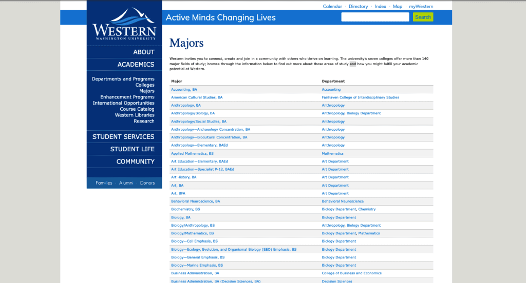
What wasn’t working
- 200+ items in an alphabetical list with no way of filtering or sorting
- Non-tabular information displayed in a table
- Only wide-screen compatible, not responsive for mobile-sized screens
Majors Homepage 2018

What was working
- Keyboard search gives a way to filter the 200+ item list
What wasn’t working
- Lime green on blue isn’t a minimum 1:3 contrast for larger text and doesn’t meet web accessibility standards
- Keyword search is pulling from just degree titles, so keyword search isn’t reliable
- Long degree titles taking up multiple lines “Biology—Ecology, Evolution, and Organismal Biology (EEO) Emphasis, BS”
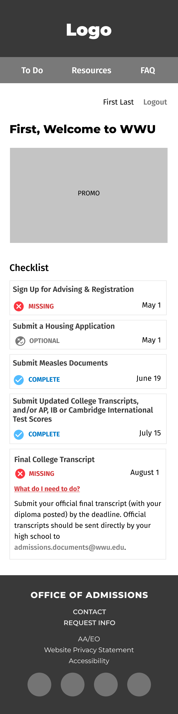
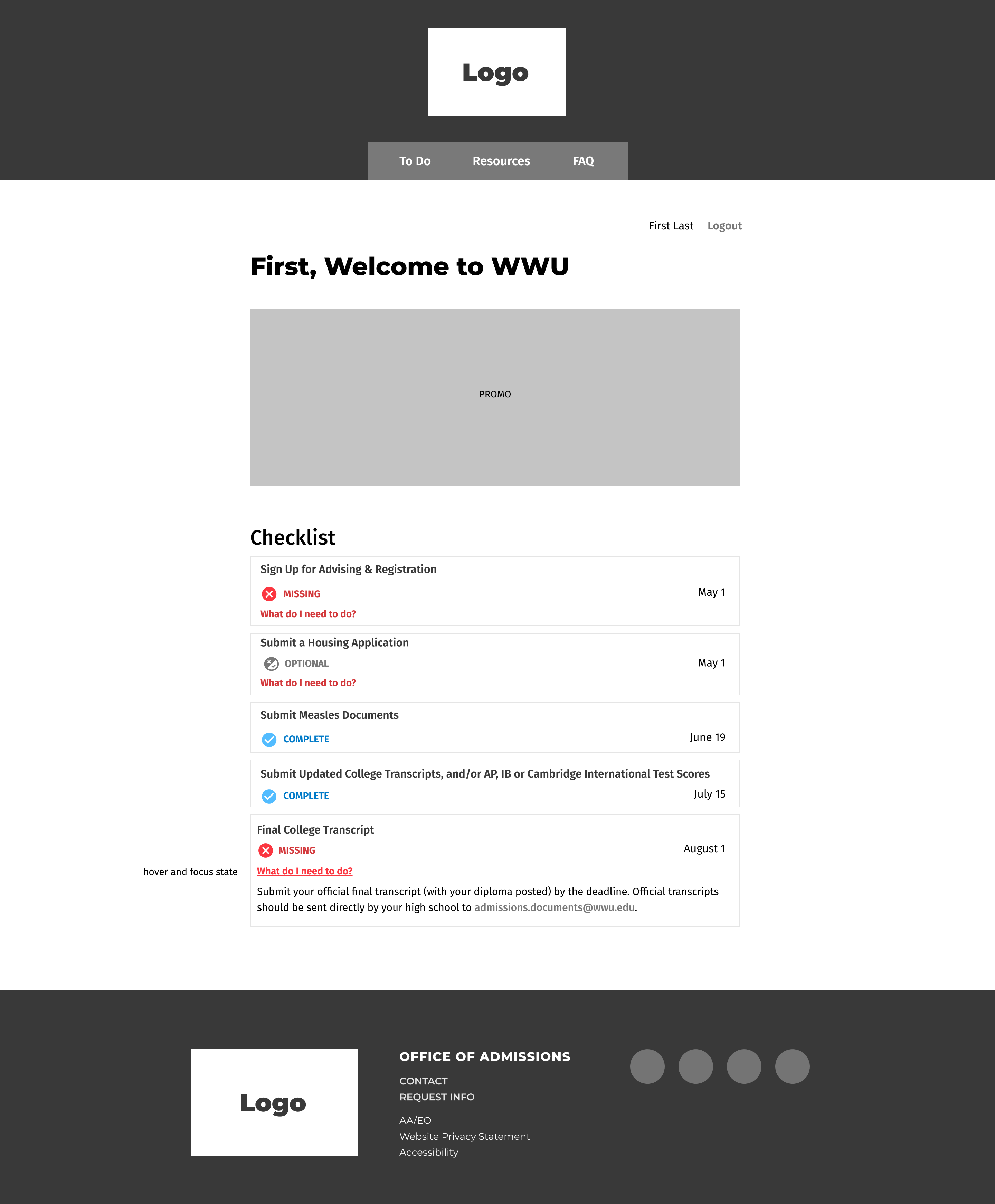
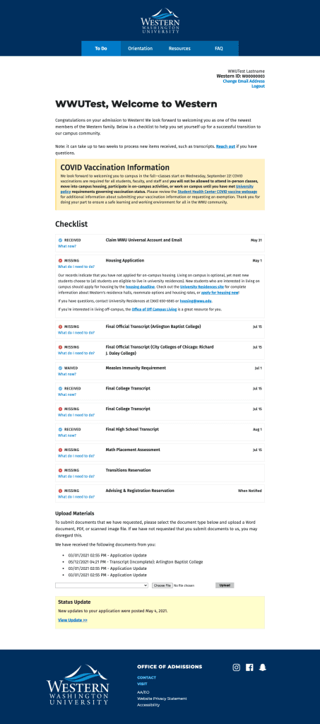
Majors Homepage 2021

What was working
- This splash header displayed a random major on page load. This is one of the features I kept.
- The list is much shorter (about 100 majors) due to consolidation from ongoing information architecture project.
- Majors names are much shorter.
- The list is able to be filtered by keyword or starting letter.
What wasn’t working
- Header block is taking up too much vertical height for the value of information it’s delivering.
- Despite consolidation, the page is still much too long and isn’t compelling content.
- There is still no dedicated field for keywords and search results rely on the contents of the body field that describes the field of study.
Process Timeline
I was the project lead and UX/UI Designer on this 12-week project from design to post-launch with a core remote team of 4: my web content assistant, a front-end developer, an SEO editor, and a copywriter.
Weeks 1–2: Migration of site content and information architecture redesign
Week 2: Design survey of the competition
Weeks 3–6: Wireframe, prototype, and review
Weeks 7–8: Coding components and building Drupal structures
Week 9: Launch
Weeks 9–10: Added search function
Weeks 10–11: On-boarding and outreach
Process Details
Content Strategy & Information Architecture
This was the end of a years long process of redesigning the information architecture for this content, writing new content, and wrangling a bunch of fields and metadata. Originally each of the 200+ degree programs had their own page.
Problems
- hard to scan-read homepage
- hard to search homepage
- redundant content on degrees pages from poor content strategy and lack of resources
- poor Google search rankings
Solution: Re-centering User Experience
College students ask “What’s your major?”, not “What’s your degree program?” Interest clusters are important to their college search.
The first logical step was to consolidate the 200+ degree programs into majors.
Degrees
Biology, BA
Biology/Anthropology, BS
Biology/Mathematics, BS
Biology— Ecology, Evolution, and Organismal Biology (EEO) Emphasis, BS
Biology— General Emphasis, BS
Biology— Marine Emphasis, BS
Biology— Molecular and Cell Biology Emphasis, BS
Biology— Secondary Teaching Emphasis, BS
Chemistry/Biology— Secondary, BAE
→
Major
Biology
The second was to assign an interest category tag to each major. A single majors can be tagged with multiple categories.
All Interest Categories
Advocacy and Social Justice
Business
Culture and Language
Design
Education
Engineering
Environment
Health
Humanities
Interdisciplinary
Math
Media and Communication
Science
STEM
Technology
Example of Majors in an Interest Category
Advocacy and Social Justice
American Cultural Studies
Sociology
Urban Planning
Urban Sustainability
Women, Gender, and Sexuality Studies
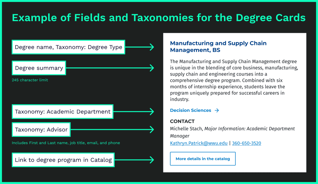
Solution: Standardizing Content in Drupal
Easier to create templates for. Easier for copywriters to manage content.
- I identified what content was shared by each major: degree programs, advisors, academic departments, etc.
- I created a new content type in Drupal with fields that fit the type of data to be stored, and multiple taxonomies for reusable data like contact info for advisers.
- This made content easier to manage: changes could be made in one place and updated in many, filter-based dynamic content, etc.
Design Survey
The university had neither the budget nor the time to do any user research. Therefore, I conducted a design survey of both university academic program and education-related private sector websites to identify familiar UX patterns for our users and assist with stakeholder buy-in.
Included in Survey
Universities (Competition)
- University of Washington
- Washington State University
- Central Washington University
- University of Colorado – Boulder
Universities (Aspirational)
- Stanford: Undergrad Majors
- Brown: Undergraduate Concentrations
- Harvard: Programs
- SCAD: Academic Programs
Private Sector
- Skillshare
- Code Academy: Catalog
- General Assembly
- Udemy
Process
- Gathering screenshots into FigJam and jotting down immediate thoughts
- 2 quick workshops: immediate team and university-wide marketing
- Discuss what was/wasn’t working
- Identify specific components and patterns that would support our goals and resonate with our audience
Outcomes
Had a good feel for the different kinds of interaction animations and patterns to explore during the design phase.
Decreased the amount of time it would have taken to design and prototype more than 2 different options by being able to focus on specific UI patterns.
Could point to specific examples from other institutions/companies when questioned by administration-level stakeholders.
Wireframe and Prototype
Process
Throughout this process I kept our front-end developer in the loop so she could let me know if something would be too difficult to implement before the deadline. Our accessibility developer was also included in the design review process. This ensured that we wouldn’t waste time on anything that wasn’t accessible.
- Draft 2–3 low fidelity wireframes
- Review with stakeholders
- Create a high fidelity mock-up and prototype any interaction animations
- Review with stakeholders
- Share final design to front-end developer
Challenges
- History of poor communication between University Marketing (UM) and my team.
- Key team positions in the management structure were vacant.
- Despite being the Project Lead, the perceived hierarchy of my position made it difficult to maintain a clear and open line of communication with UM leadership.
- UM leadership wasted time making their SEO content designer flesh out specifics for a different page structure without looping me in.
- I had to create an additional high fidelity mock-up at the last minute to please leadership. They ultimately did not pick this design.
- This ended up delaying our launch date by a week.
Option 1: Individual major cards


Option 1 cards (small-screens): No hover state for mobile means adjusting elements. Strict character limits on the synopsis ensure that the card functions correctly at all screen-sizes.
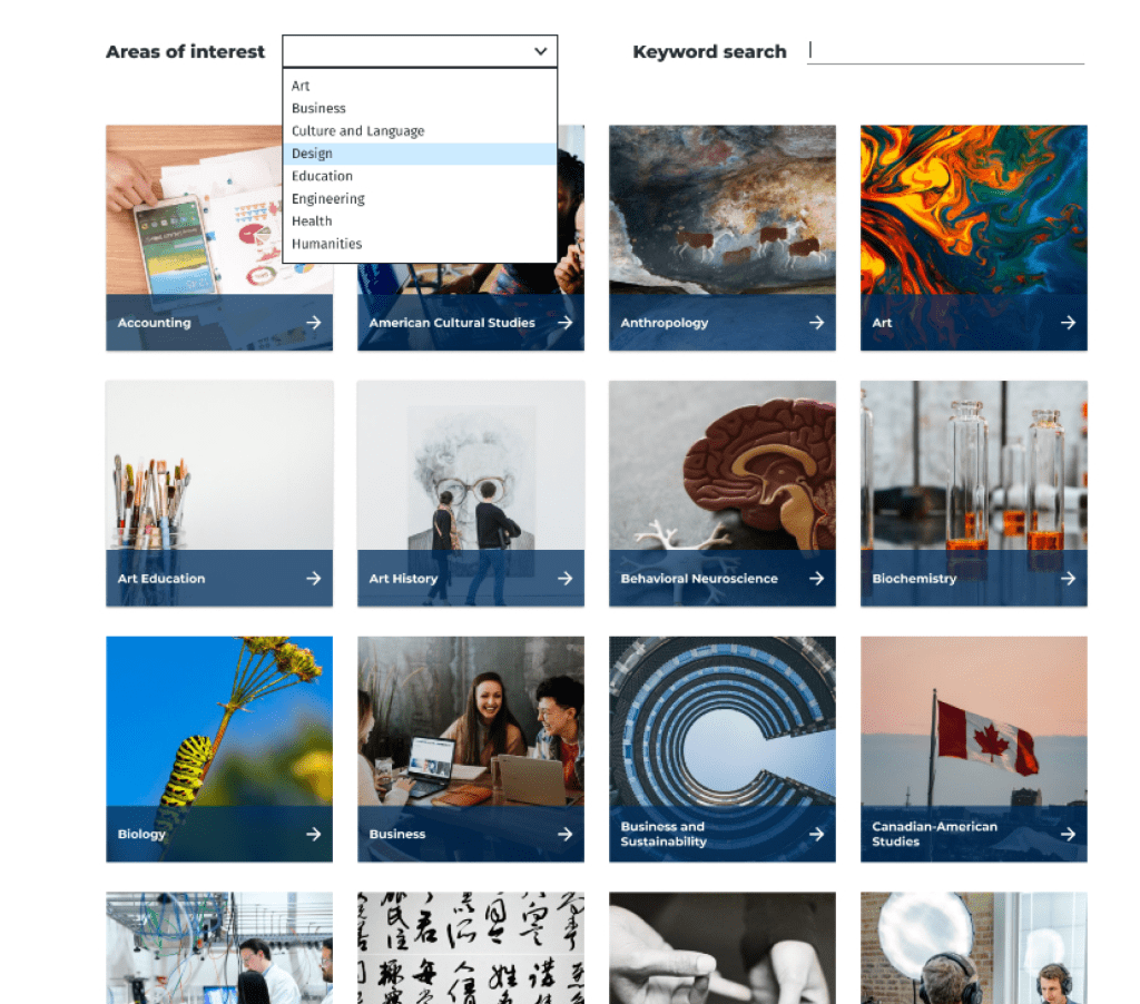
Option 2: Interest/program sections

Option 2 layout: Single column, large cards for each Interest (12 total). Was initially preferred by some internal stakeholders for the SEO possibilities (Carnegie Dartlet, who was consulting for our search campaigns, was strongly advocating for more text on the homepage).

Option 2 cards: Example of how they would stack on mobile
Wireframe Review
Option 2: What was working
- Stakeholders liked the large vibrant images
- SEO expert liked that there was more text on the homepage for keywords
- Shorter than previous version with alphabetical list
Option 2: What wasn’t working
- Not searchable or sortable
- User would have to read through multiple sections to see if the major they were interested in had been put into that interest category
- Our idea of what category something belongs to might not match a user’s expectations
Final Design (High-fidelity mock-up of Option 1)
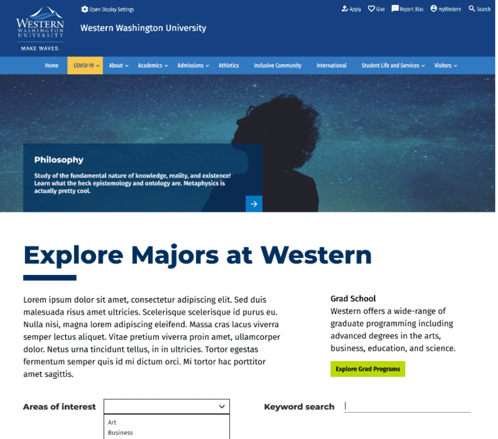
Header
- New splash header is shorter
- Headline box is anchored to bottom of image and has a simplified arrow button just like the cards below.
Grad School
- Moved this to be higher on the page to support the graduate school’s goals
- Previously, this was at the bottom of the page with a list of interdisciplinary items
Filter and Search
- New ways to search, by keyword and area of interest
- Dedicated keyword field delivers consistent search results that can be customized
Cards
- Cards with attention-grabbing imagery have replaced the text-only alphabetical list
- On wide-screens, the cards have a simple animation on hover that reveals a short tagline for the major
Build Components and Drupal Views
Incoming Deadline
- Sharing the workload with another front-end developer allowed us to meet our tight deadline.
- She could focus on the bulk of coding based on my design.
- I could work on setting up the Drupal structure to support that component at the same time.
Coding Components
- Front-end developer posted the code in Jira for discussion.
- I could branch the code and make edits.
- Final components were merged into our main Drupal Theme for use on the live production site.
Building the Page
- Created a new page to test and build.
- URL aliases would be swapped afterwards to not lose any analytics data.
- Added new fields to majors: short description and interests
- Drupal View with a display block for a grid of all majors cards.
Launch and Tweak
It was important to launch on time based on marketing’s customer journey timelines. So early on I made the decision to release improvements in stages after the initial launch. The two additions were Keyword Search and Interest Search.

Keyword search
Originally, we pointed to an existing field (major synopsis) for the keyword search to reference.
After getting faculty feedback that some majors weren’t showing up as expected in search, I knew we had to fix it. We didn’t have in-house writers to rewrite the Major synopses to incorporate keywords so they’d show up in search. I decided to create an additional field in the Majors content type just for keyword search terms.
This change met expectations about search results and campus stakeholders were pleased.
Interest search
I looked over all majors with the SEO expert and created interest categories. We then determined which categories applied to each major. I forwarded the list to the Digital Marketing Assistant to implement by filling in the added fields in the content type.
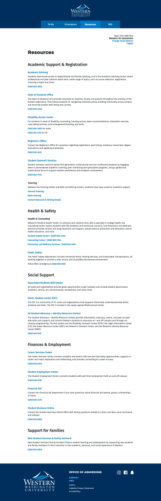
On-boarding and outreach
I supported on-boarding and outreach in multiple ways to ensure the sustainability of the project and content from launch. These took different forms for the Admissions Team and SMEs/other stakeholders.
On-boarding for Admissions
To support content governance for the team who oversees the Majors site, we needed thorough documentation. This was created in ClickUp, our project management system.
- How to communicate with SMEs
- Best practices for content
- Specifications for content (character length, image sizes, etc.)
- Breakdowns of how each Drupal content type, view, and taxonomy are set up.
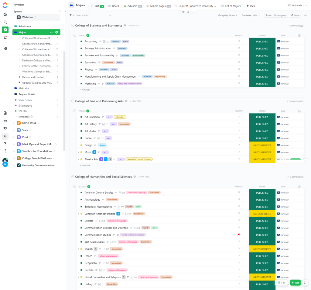
Each page was given its own task with interest tags. The team was able to track the status of individual pages, make notes about content and SEO changes, create subtasks for regular content reviews, and share docs with SMEs.
IT Project Management with ClickUp
ClickUp is the Project Management System that Admissions Comm team uses. I was the lead of the team that implemented it and am the go-to support person at WWU.
Key Features
- Links to all related Google sheets and docs in top navigation bar
- Majors are tagged with interest
- Sorted by College (easy to share with specific faculty and staff)
- Easy to query status reports
- Easily keep track of update requests via automated form
On-boarding for SMEs and Other Stakeholders
Internal Emails
- For awareness and outreach
- Sent quarterly and when I get a request or inquiry from a department.
Google Doc Template
This Google Doc is able to be shared with anyone in case of external stakeholders.
This version has been stable and working for over a year, but it went though a lot of testing and changes to fit it to faculty stakeholder needs. For example: I found that faculty needed long descriptive fields for them to feel comfortable using this template unaided.
Key Features
- Heading structure enables easy navigation and mirrors the current major page structure.
- Clear character limits (when needed)
- Detailed field descriptions about purpose and tone, with suggestions about possible content.

Presentations to Academic Advisors
- Quarterly presentations to academic advisors so new employees are aware of the site
- Give them a sense of ownership over the content, it’s a collaboration not a mandate from on-high
- Chance to get feedback from internal users
SharePoint Page
Internal site only accessible to employees of Western Washington University. This has been shared widely through emails and workshops. Content is geared towards academic advisors, department managers, and faculty.
Page Content and Layout
- Intro to the project
- Purpose of the site and content on it
- Link to request changes
- Link to content template
- Links to helpful tools
- Team roles and how to contact us

Project Outcomes
The Majors site launched only a week late as a MVP. I added additional search functions within a week.
- Increased traffic the Majors site homepage by 32%.
- 15 Majors that had never shown up in the search rankings before, started showing up there within 2 weeks of launch
- Greatly improved content ops for this site
- Content update tickets are fully automated via ClickUp forms, no more hunting through long-email chains for content update requests.
- Academic department representatives have a better understanding of these pages, who they serve, and what content needs are.
Page Views increased for almost every major page YOY Q1
Computer Science
Biology
Business
Administration